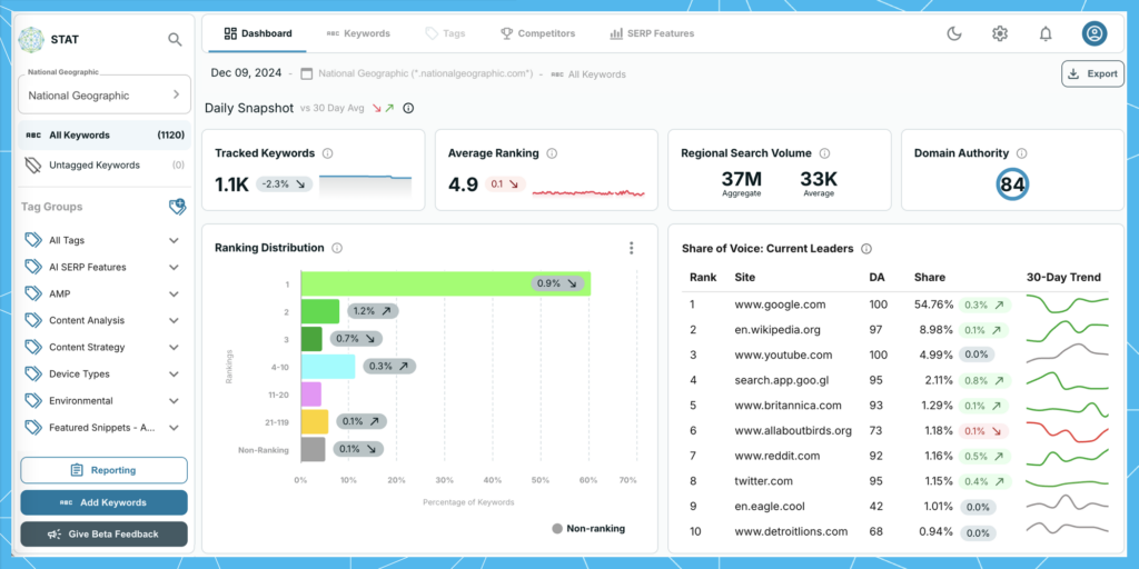
The wait is officially over — your brand new STAT is ready to be unwrapped and taken for a test drive.
The hotly anticipated update to our Windows ’95-era UI is now in open beta, and we are so thrilled to send you into the new year with the start of a whole new STAT.
Redesigned to cut through the noise and draw attention to the metrics that matter most, our revamped and revitalized STAT will help you surface more insights in less time, and move you from insight to action more quickly.
Since there’s so much ground to cover, we hope you’ll join us for a live tour of everything our new UI has to offer now and down the road. Simply sign up for the day that works best for your timezone:
(Jump ahead to learn how to access the beta.)
The best things about STAT 2.0
We worked hard to assemble a STAT that exceeds your expectations — one that is:
- Up to date and intuitive
Striking, visual simplicity meets user familiarity in an incredibly sleek, thoroughly modern STAT — we’ve gone from spreadsheet to spreadchic. All-new buttons, fonts, icons, and colours come together to ensure lightning-fast comprehension and clarity on what steps to take next. Redesigned data visualizations help you to better understand and tell the stories in your metrics. - Easily explorable
Streamlined, consistent workflows, enhanced accessibility, and improved functionality deliver a slick user experience and increase discoverability in STAT’s deliciously data-dense platform — so you can spend more time on the work that matters most. - Future-forward
Built with an eye towards innovation and adaptability, our new UI doesn’t just look nice, it’s built with tech that allows for faster feature releases. A revamped STAT marks the start of a whole new adventure. - Client focussed and feedback-infused
Providing a North Star and keeping us true to ourselves, all your thoughtful feedback shines brightly in our brand new UI. You asked us not to change the things you love most, so we’re still the same great STAT you’ve come to rely on for easy and accurate SERP tracking — we’re just better now, and much more beautiful to behold.
Now let’s get to the highlights!
Dark mode
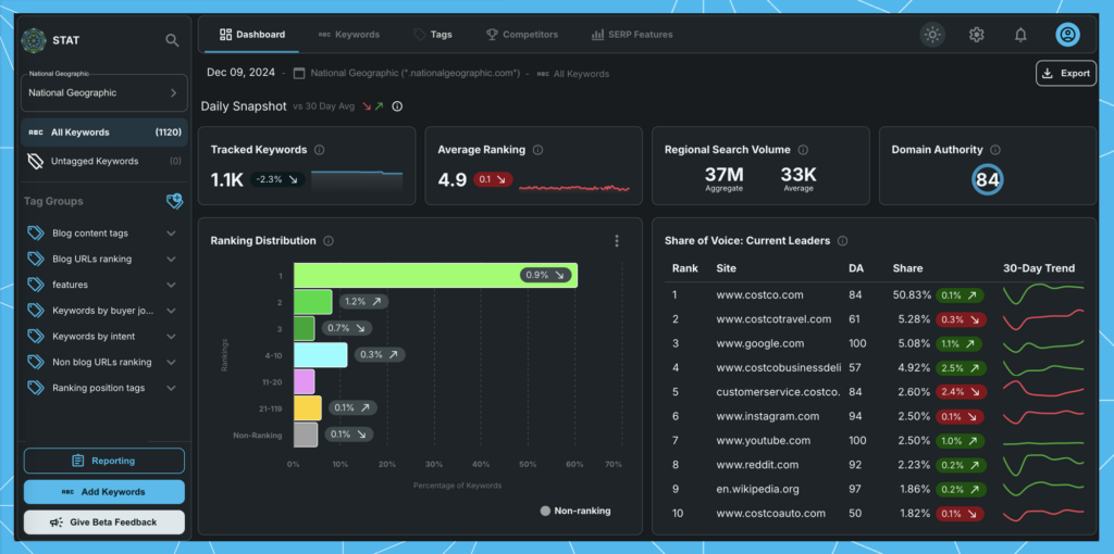
For starters, we’re not just bringing you one new look, but two. The new STAT comes in modes both light and dark.
Going dark mode can extend battery life, reduce glare, and cut down on blue light exposure, but let’s face it, it also just looks cool. Instantly switch between light and dark aesthetics by using the sun and moon icons in the top menu.
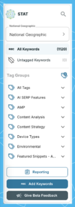
Streamlined navigation and project organization
One of the first things you’ll notice — and one of the biggest UX changes we made — is that there’s no longer a Home tab, and the left nav has been updated for peak operational efficiency.
What was once a Home tab with a Projects nav and individual site tabs with a Data Views nav, is now a singular global nav that does the work of both, making it faster to get around and easier to organize your life in STAT.
The steps needed to create new projects, sites, and tag groups are now more prominent and clearly labelled, and tag activities — like adding, removing, and backfilling — are no longer hiding behind a right-click. Now, simply click the menu icon for a dropdown of all the actions you can take.
Trends and changes in metrics stand out more
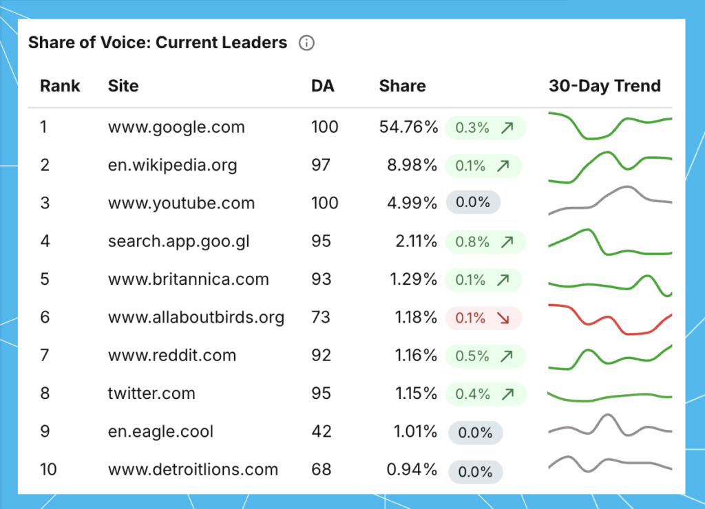
Changes in your data are now easier to spot thanks to more up/down arrows and better colour-coding — green for increases, red for decreases, and grey for when things are static.
Nowhere is this on display better than in the Current Leaders chart in the Competitors tab. Keen observers will also note that we’ve combined it with the Gains and Losses chart to create a more streamlined experience (we even added in an extra comparison date: vs. 365 days ago).
In the Dashboard tab, trends in share of voice are also faster to find with the help of new 30-day sparklines in the Share of Voice: Current Leaders chart, which are colour-coded to match the directional changes seen in the chips. (To align with the rest of the Dashboard, we also changed the metrics in these chips to reflect a comparison against the 30-day average — previously it was vs. 30 days ago.)
Better readability
To improve scannability and comprehension, we’ve made a handful of changes to tables across STAT.
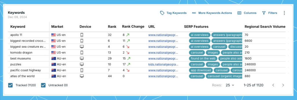
Columns can now be picked up and moved to sit in any order you need. Rearrange them to better understand your data or to create more concise screenshots for sharing out. All column widths are also now freely adjustable, giving you more control over your viewing.
And since so much time is spent in the keywords table, we paid extra special attention to it. There you’ll find country flags and device icons to help cut down on the number of words you need to read, as well as chips to better see the SERP features that show up. You’ll also find the option to change the table’s row height, so you can choose to have more or less data on the page.
More helpful tooltips
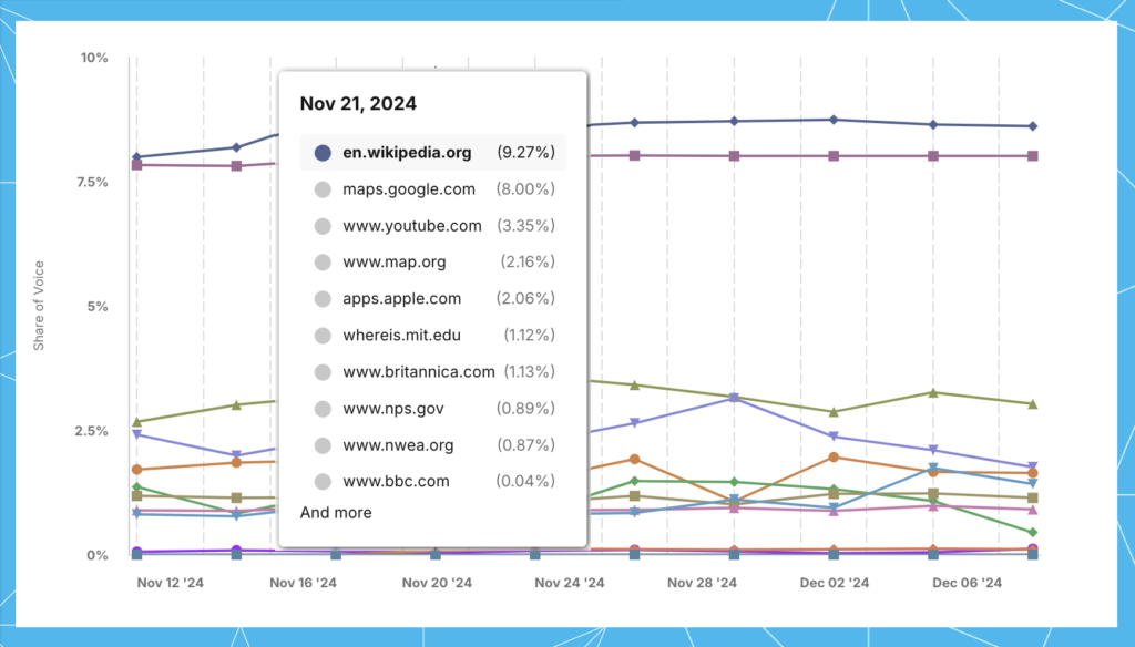
The tooltips that appear over line and bar charts now contain more data and are easier to read.
For example, hovering over a data point on the Top 10 Trending chart in the Competitors dashboard now brings up the share of voice percentages for up to 10 sites selected in the legend, whereas previously you’d have to scroll over each site to see the individual value.
More fullscreen views
There’s a lot of granular data packed into STAT, which is why we’ve provided more opportunities to view it in fullscreen — while still having the ability to customize as you need.
Take the Keywords table for example, you can make it fullscreen and still add/remove columns, change tracking and tag status, and filter the table to your heart’s content. We’re also big fans of viewing the full HTML SERP as big as can be, and using the calendar to flip through the daily archive of SERP snapshots to see how the visual landscape changes over time.
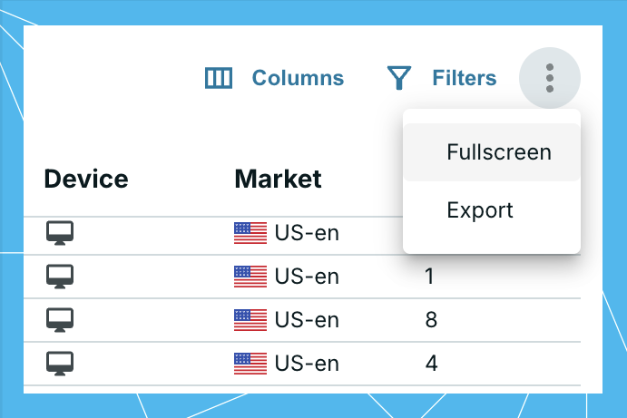
Find the menu button at the top right of almost every chart in STAT and click Fullscreen.
More exporting
All those menu buttons also contain an Export option, which gives you the choice between four different types of exports — PNG, JPG, PDF, and CSV (the latter two are coming shortly).
This both expands the number of places you can export data from but also the number of ways you can export that data.
More toggling for more data
In some places, existing toggling you might not have known about has been made much more prominent. In other places, we’ve added toggling to things you couldn’t toggle before.
For example, you can now expand all ranking buckets in the Ranking Distribution vs Averages chart, allowing you to compare all distributions at once.
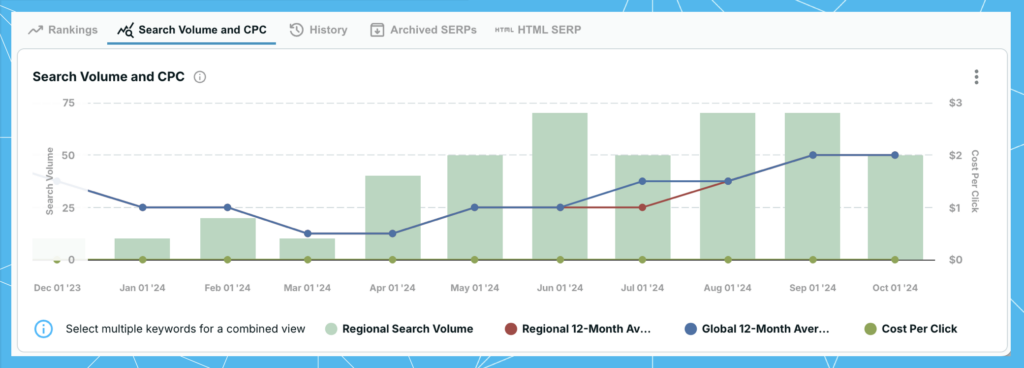
Did you know that the Overview subtab in the Keywords tab has a dropdown menu with two completely different types of metrics you could flip between? If you didn’t, that’s the reason we’ve replaced the one subtab with two. You’ll now have quick access to the Rankings and Search Volume and CPC charts.
What’s coming soon
Over the next few months we’ll be moving the last little bits of STAT into the new UI. This includes:
- Keyword Suggestions and the Add Keywords workflows
- CSV and PDF reporting
- Alerts
- Site, API, and share of voice settings
- Account management
- A wholly re-imagined Tags tab
In the meantime, we know it won’t always be the most seamless experience to jump between two different decades of UI. While we would have loved to unveil a completed STAT 2.0 in one extreme makeover reveal, it’s much more important that you have access to new-and-improved the second it happens.
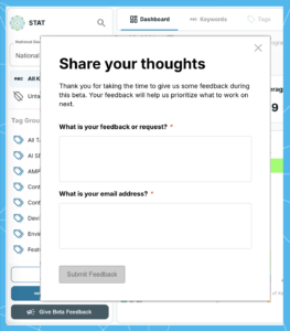
And of course, as you take the new UI for a test drive, we welcome all your feedback! To ensure we’re delivering a STAT that you continue to love, we’re serious about your suggestions and user experience, so please don’t hold back.
To make giving feedback a breeze, we’ve added an in-app form for you to use any time something comes up.
How to access the beta UI
Now that the details are out of the way, here’s how you can get in:
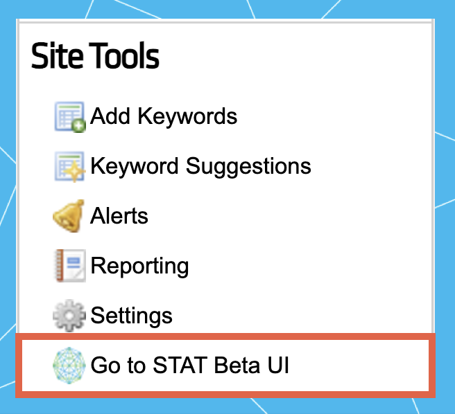
- Log into your STAT account
- Head down to Site Tools in the bottom left corner
- Click Go to STAT beta UI
And that’s it!
When accessing the new UI, it’ll open in a separate tab. This will allow you to get used to the new look and feel and complete any actions currently missing in the beta. Anything you do in one UI will be reflected in the other.
Join us in January
We hope you enjoy getting to know the new UI as much as we enjoyed building it (which was a lot) and that you’ll join us in January for one of two walkthroughs:
Happy exploring!
The STAT team

